Choose Your Theme
Warren Shea

Archive for the ‘Google+’ Category

worldofwarren – CSS & PNGs optimized…sorta

Wednesday, February 27th, 2013 at 11:38 am

So when I built worldofwarren.com, I thought it’d be a great idea to use 1 CSS file (in PHP), and pass the theme as a parameter into the “css” file via querystring and have the php figure out what to output. I guess the + side is that the php would do server-side compilation of the code. So I thought maybe it was faster. Also, I’d only have to maintain 1 css file and I wouldn’t have that much css duplication in the php file because styles that could apply to 2 themes could go under the same if statement.

But…I realized…that was probably incorrect, in terms of optimization. Because each time a user requested the “css” file, the server would have to serve up different php compiled code, based on the querystring. I don’t think such a file can be cached as well (can php be cached? it likely changes all the time…)…and cache without the need for server-side code is probably the fastest method to achieve quick load times.

So I’ve created separate CSS files, 1 for each theme, to improve load.


I’ve also re-optimized my PNGs. Someone told me about a site, http://tinypng.org/ that greatly reduces PNG size, while keeping the quality relatively similar. I’ve cut down the images on warrenshea.com from 6MB to 2MB. It was like shopping at a closing Zellers: HUGE SAVINGS!

I guess I’m learning more and more about the web and thought it’d be good to apply these optimization methods to my sites. One of my interview questions is “How would you optimize page load of a site” so if anyone ever asks me that, I not only want to be prepared, I want practical experience!

I’ve also been doing quite a bit of photography lately. I’m at 13/43 statues. From 1/8 to 1/3 done :) I’m getting there…

Responsive Layout + worldofwarren.com

Wednesday, February 20th, 2013 at 1:04 am

About 5 minutes after my last post, I realize…I can’t really do a fully responsive layout with all my themes. Some of the themes will work with a responsive layout (gmail, google+); some (megaman, naruto) will not. So I’ve decided not to support multiple themes on mobile devices, much to my girlfriend’s dismay (she likes the megaman theme).

As such, I’ve been able to create a responsive layout that will occur upon using the Google+ Theme (which is the default theme).

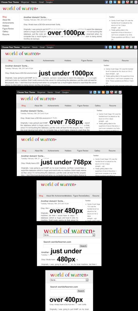
Going to my site on a variety of resolutions will now show different results. Breakpoints are:
1000px, 768px, 480px.

It looks like:


Click the picture for a bigger one.

It was pretty easy. While it’s not the proper 16-grid responsive layout that I originally wanted to do, this custom responsive layout serves its purpose. If not for my multiple themes, I’d definitely want to properly do this. Not sure if I should be doing it for my warrenshea.com site. Its current layout is so much a part of the site…I don’t know if I can/want to mobilize it.

Anyways, feel free to check out this site on your iPhone or Android! I’m very happy with the results. Having the navigation in a dropdown; having the search at the top will really make going to my site on those drunken nights at the bar when I bring up something from my life easier. That’s the main purpose for this responsive layout, to make my site more usable when i’m drunktarded.

Also – two resources I found useful to do a responsive layout:

  • Responsify.it – a good place for a responsive template. Rather than use some person’s template, I found (and asked around) that it was better to create your own to understand and eliminate bloat.
  • Viewport Resizer – The best thing ever! Saves a bookmark to your bookmarks which, when clicked, adds a small viewport toolbar to change the viewports of your webpage but stay on the same page. You have to see it/use it to believe/understand it. But this thing is AWESOME.

Google+…wuhhh?

Thursday, April 12th, 2012 at 12:53 am

Google+ has changed its layout.

Check it out here.
…also, I get a nice Google+ hit cuz if you’re on this page, maybe you’ll wanna hit my Google+ profile ;)

Anyways, back to the layout changing. You’d think that doesn’t matter to me too much…except my main worldofwarren.com theme right now is (old) Google+. And let’s face it, as much as the GMAIL theme was interesting/practical, it’s simply just uglier than the Google+ version. Fluid layout is tricky.

Things I like about this Google+ redesign:

  • Scrollbar (require Google Chrome to see it…boourns)
  • Left Icon images/Navigation that is position:fixed (so it’s always there). Pretty and I like it. Which means if I revamp MY Google+ layout, I might copy that. But I doubt I’ll revamp my layout cuz…

Things I dislike about this Google+ redesign:

  • Cover Photo. Um, a little TOO similar to Facebook now duntcha think? Innovative? No.
  • While I like the Google Chat appearing if you have “extra” room…W.T.F. is with that awkward moment between when the window is perfect size without chat and then you horizontally increase the window…and then the chat pops up. For a moment in between those 2 states, it looks hideous!

    Hmmm…

    Interesting, it looks good on 1024 width (no chat) AND 1280 width (chat). The only default resolution width between those numbers is 1152×864 which deals with 1.5% of people. Effectively, they’ve found that perfect number/size for that chat column. And I can see that Google+ is MEANT to be seen on an exactly 1280xwhatever resolution. Everything fits PERFECTLY at that width. Interesting. HOWEVER.

  • For larger resolutions, like a widescreen monitor for example, what is with ALL THAT EXTRA WHITE SPACE. Could that look more hideous? I mean…it’s funny, it’s like how GMAIL is. The reason I liked the old Google+ theme was that it was like Facebook/Twitter. Fixed width. Centered Content. WINNING SOLUTION. But no, this is Fluid width…regarding white space. Fixed width, Left Aligned regarding content. EW. REGRESSIVE UPDATE?!
  • So there are PROS and CONS to the redesign but I’m fairly disappointed. I don’t quite get what was wrong with the old design.

    With both my GMAIL and Google+ themes being replaced by newer Google themes, I’m starting to think maybe I shouldn’t copy themes anymore >_< ….but i’m not a designer and IT’S JUST SO MUCH EASIER than making a theme by myself. I’m a developer, I just want to develop the theme….not design it. What do I do about my themes? Suggestions…?