
I spent a lot of the weekend taking more pictures…and trying to get the color right. It’s important to me that the color on these photographs is accurate to the statues…so I’m trying really hard to make it right.
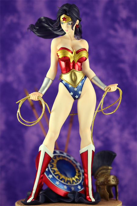
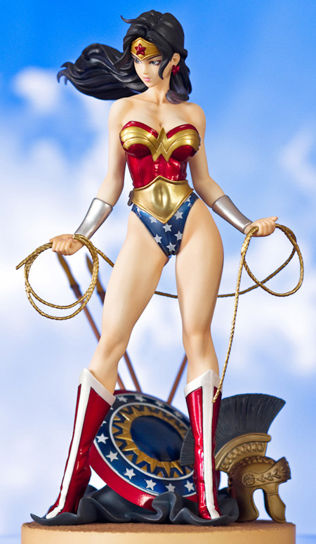
This was my last “best” Wonder Woman. It was color corrected with a grey card to get the color temperature right.
f/2.8
ISO 100
Exposure 1/60
Using a lightbox and set on cloudy
Color corrected.
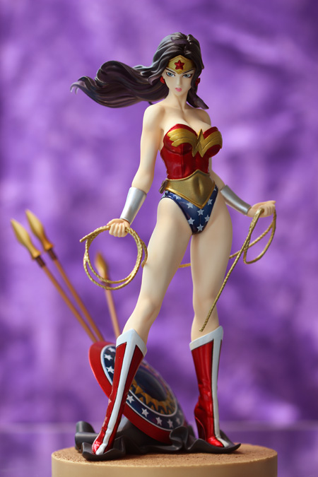
f/2.8
ISO 100
Exposure 1/250
Taken outside, using Noon-ish sunlight on the left + diffusion panel
Camera was (probably) set on Daylight but may have been set to Shade
Color corrected.
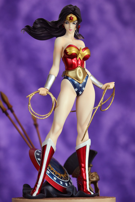
f/2.8
ISO 125
Exposure 1/125
Taken indoor using 5pm-ish sunlight (coming from the right) and using a reflector on the left.
Camera was set to Shade

Color corrected…even more than the last! With level adjustment layer, in Photoshop.
All other settings are the same
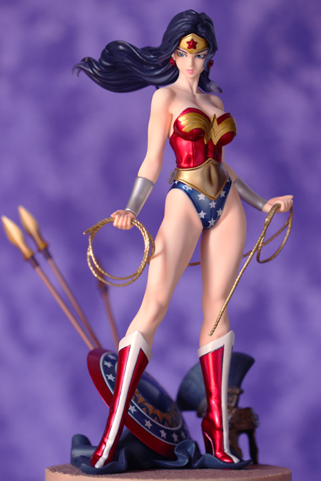
Color corrected
Taken indoor using 8:30am-ish sunlight (coming from the left) and using a reflector on the right.
All other settings are the same as before
I think some of the colors are a bit too strong, I need to tone them down…but for the first time ever, these photos accurately portray the skin colors correctly. It’s not too blue/zombie like. I can adjust the colors a bit later…but it’s close to my “what i wanna be” example:
I used to think that I wanted a photo to have light. SO MUCH LIGHT that there were no shadows. But I was incorrect, shadow provides depth. But you don’t want too much or you lose information. You want subtle shadows. And you don’t want blinding light as that’s a loss of information too.